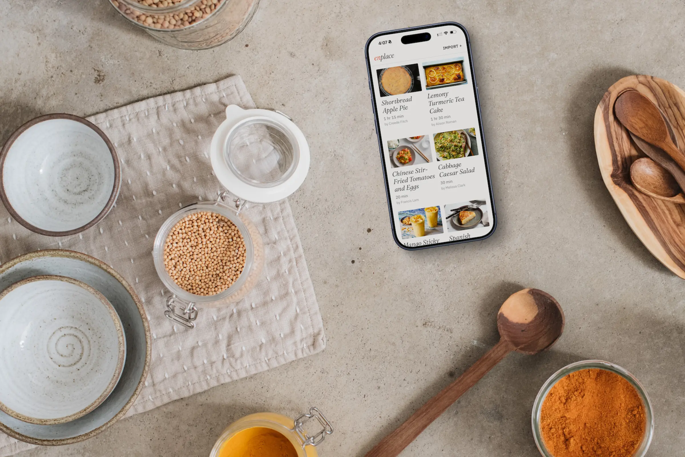
enplace

Nothing skipped, nothing doubled
Product Designer
3 Weeks
UX Systems & Mobile App Design

I cook a lot. Recipes still get the better of me.

I cook from recipes three or four nights a week, half out of cookbooks and half from the NYT Cooking app. I'm also a skimmer and a bit of a frantic cook. That combination means I'll read a step, miss an ingredient buried in it, and find out three steps too late.

So I cook with a finger holding two places at once, going back and forth between the steps and the ingredient list to make sure nothing slipped through. When a step says "add the oil, garlic, ginger, salt and pepper," I'm suddenly hunting five separate lines to find out how much of each and how it's prepped.

The worst is an ingredient split across steps. 2 tablespoons of oil, check. Next step: turns out half of that was for something else. There had to be a better way, and with everyone talking about vibe coding, I figured the better way was to just build it.

Garlic? Crap, when was I supposed to use that? Oops. That was the last step.

My first idea died on a phone screen.

The instinct was two windows: ingredients on one side, steps on the other. Tap anything and its connections light up across the divide. On an iPad it might have worked. On an iPhone half of what lit up was off screen.

So I started designing indicators to point at highlights you couldn't see. That was the tell — when you're building arrows to show people what they're missing, the layout is wrong, not the arrows.

The pivot: stop trying to show everything.

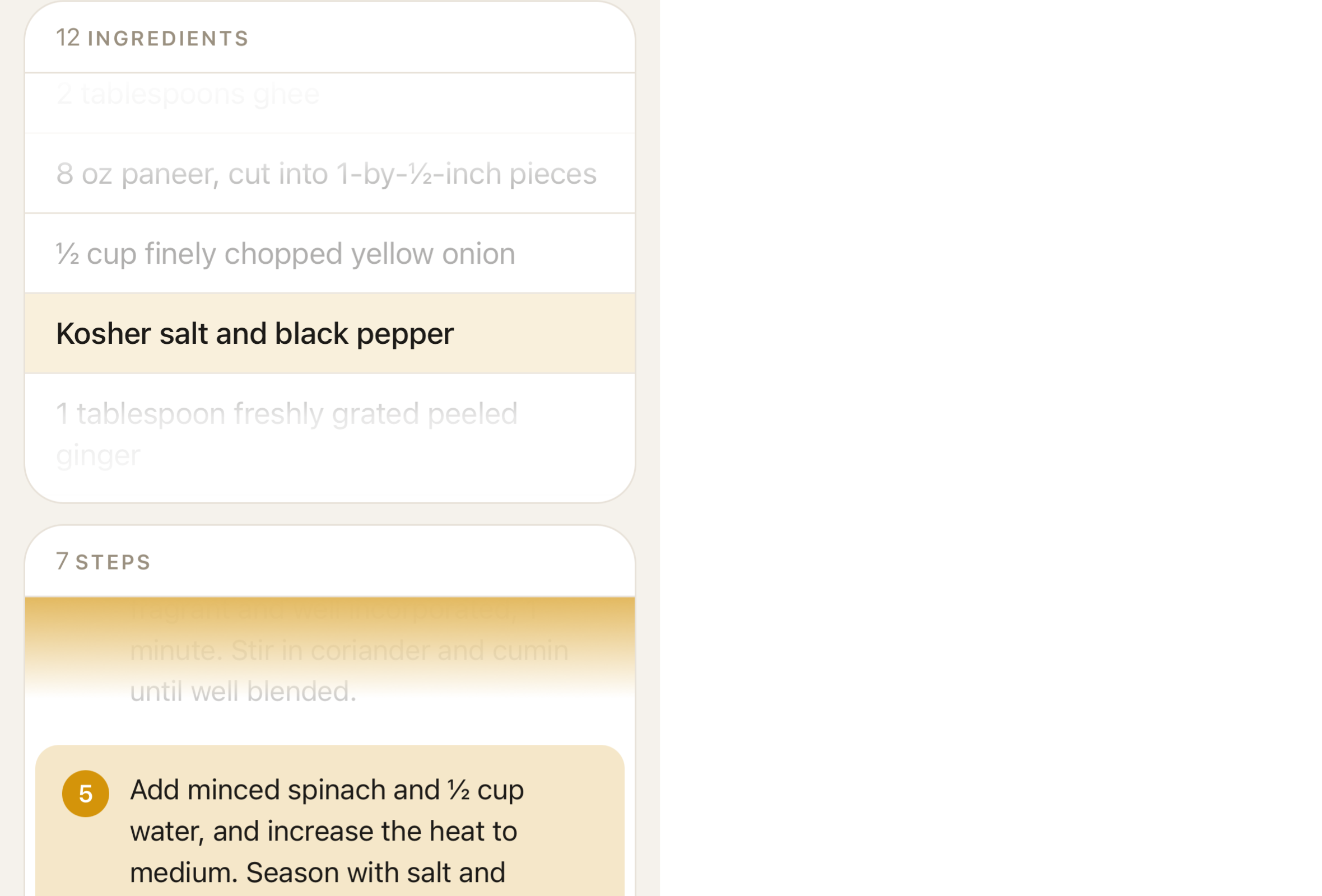
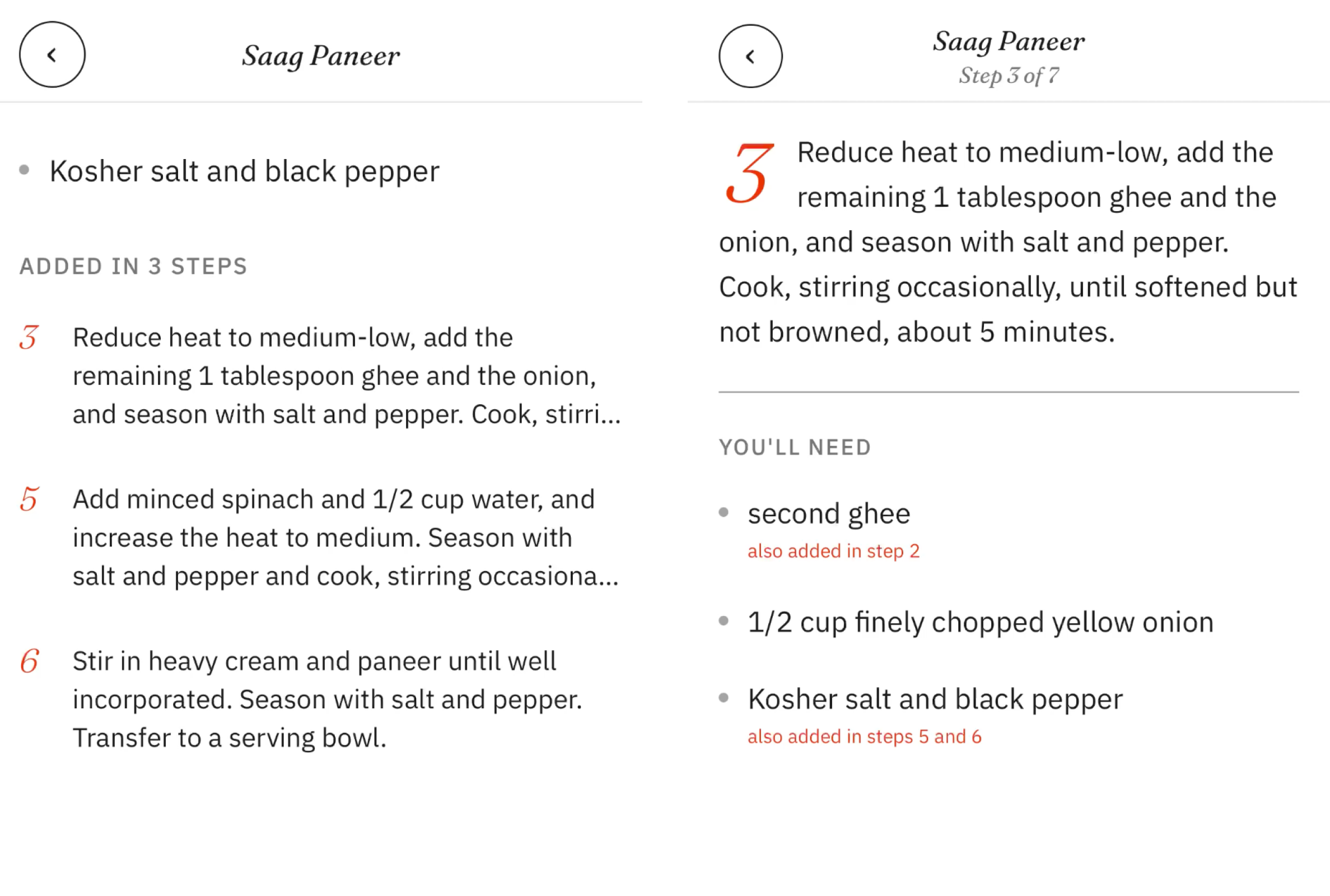
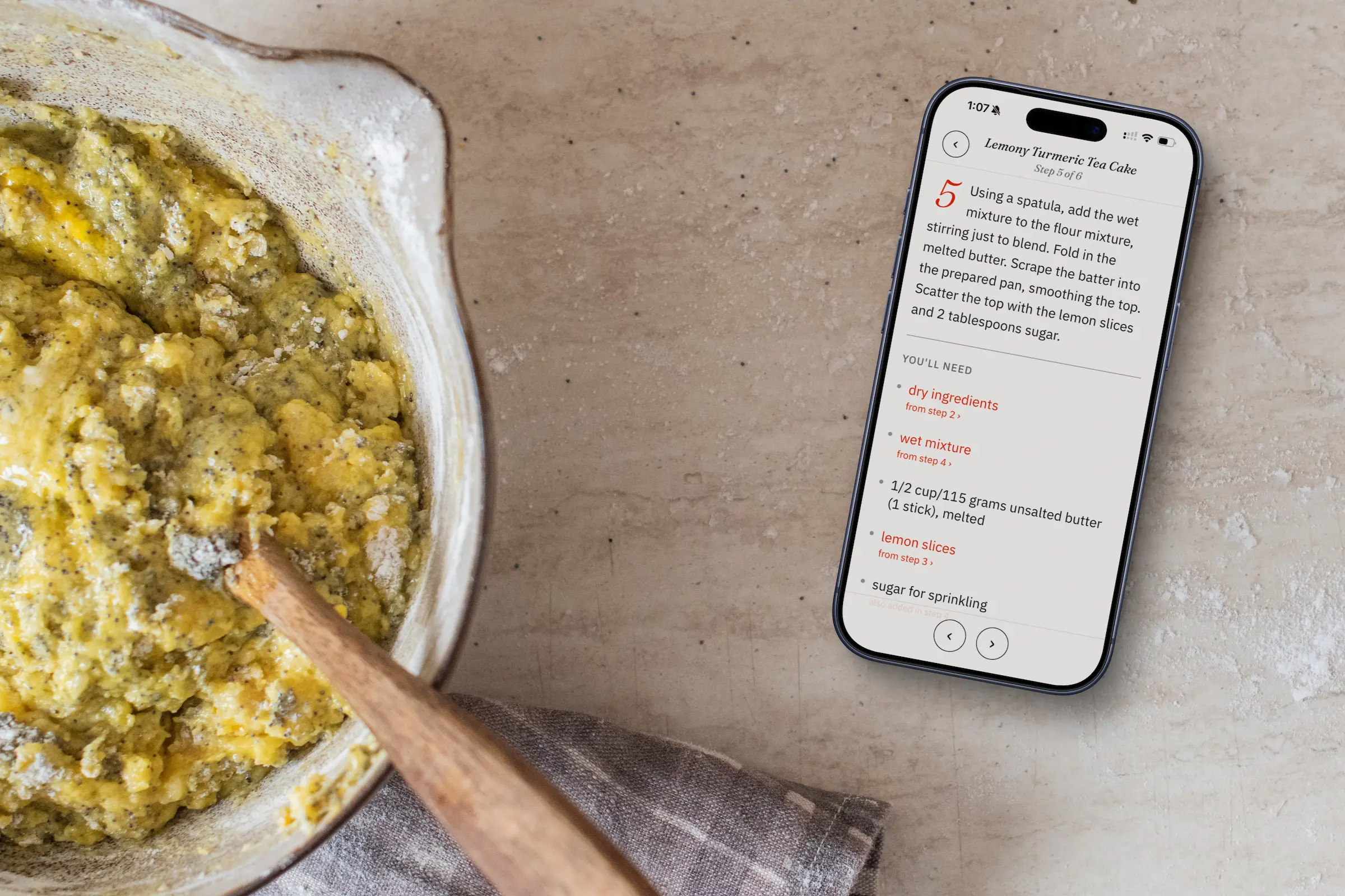
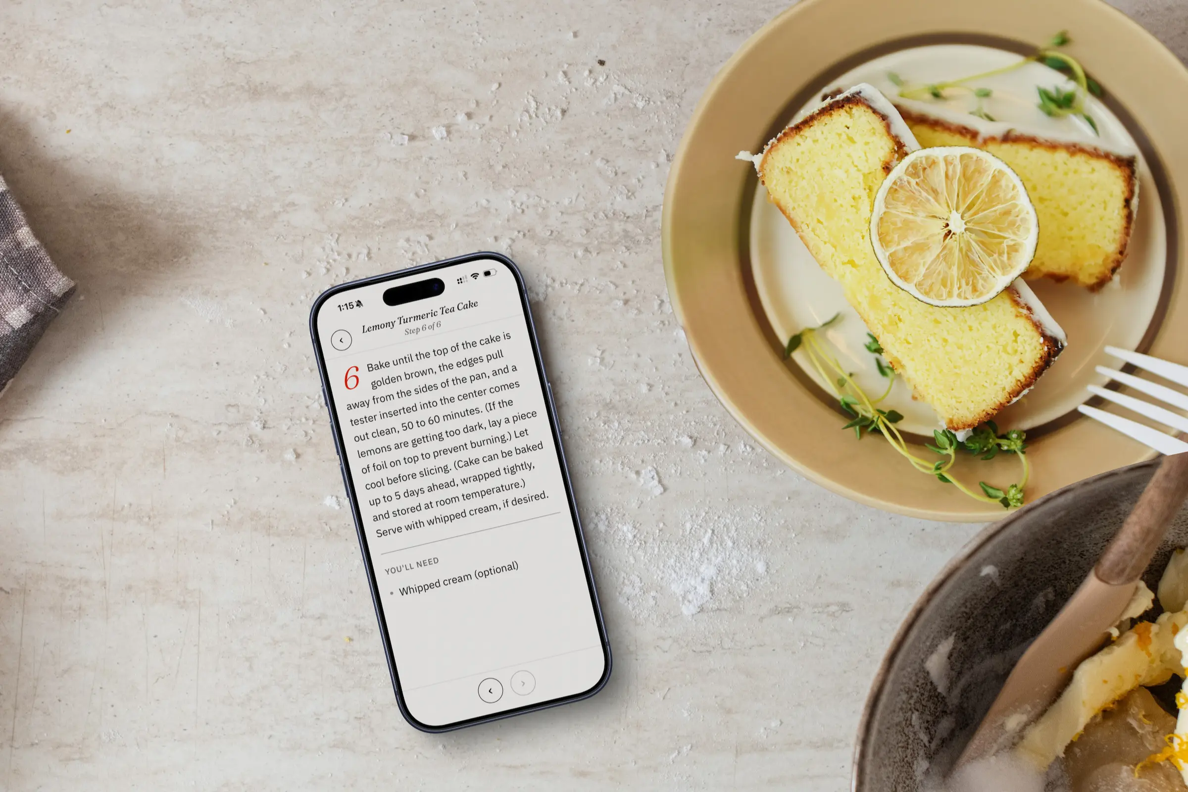
The a-ha was giving up on one screen that does it all. Tap a step, get a focus screen with just that step and the ingredients it adds — quantities and prep right there. Tap an ingredient and it flips: every step it touches, including the two tablespoons of oil you were about to pour in all at once.

Same connection, both directions, no hunting. Everything else in the app just supports that.

Tap a step, see what it needs. Tap an ingredient, see where it goes.

Then Coq au Vin broke everything

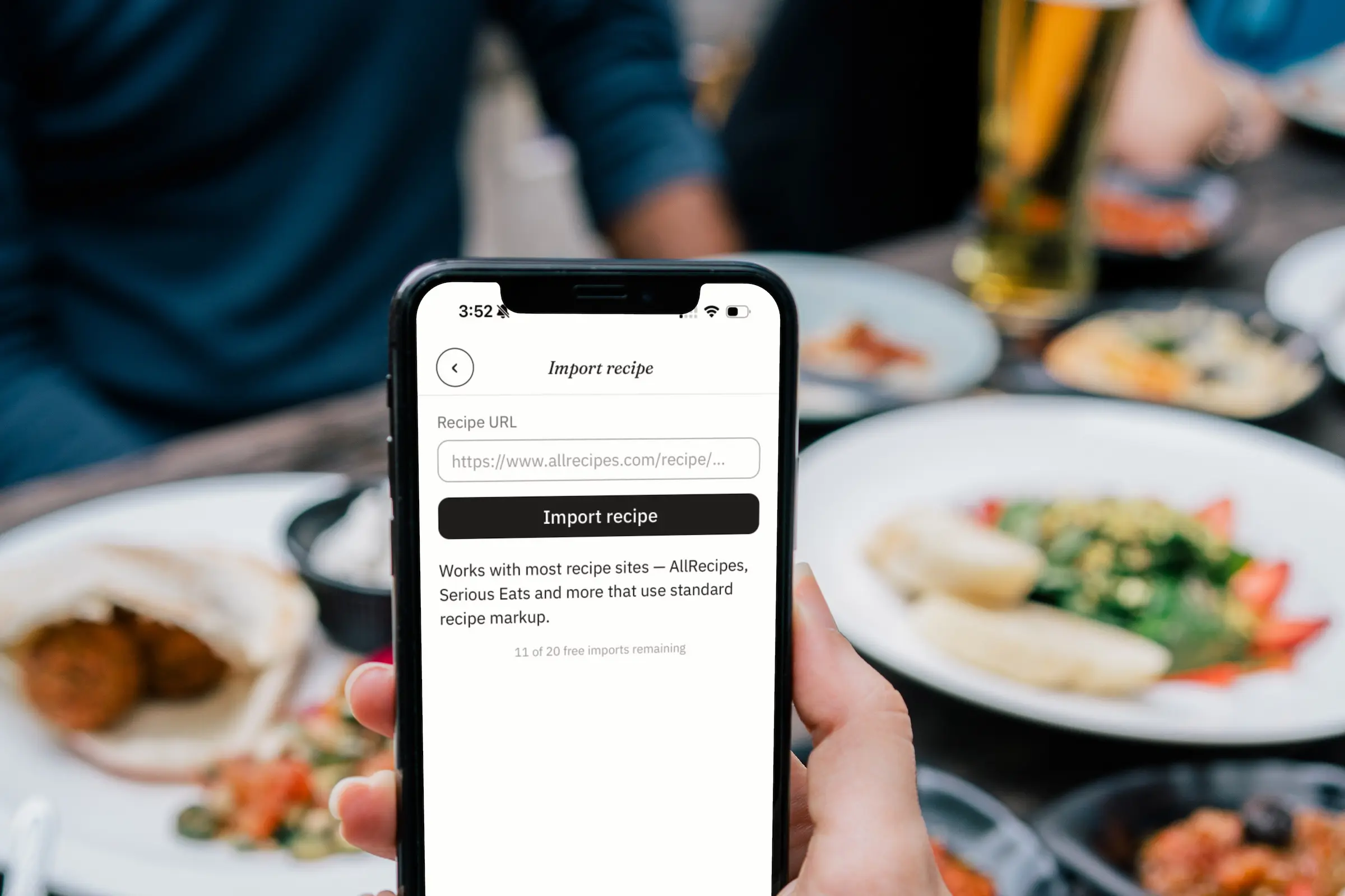
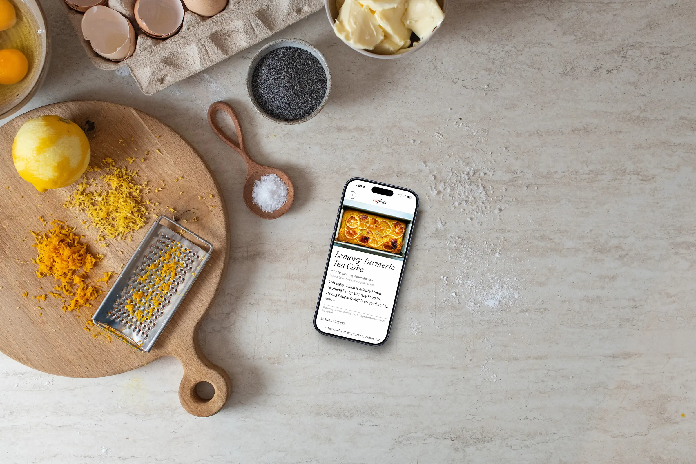
An app like this is useless if you can't get recipes into it. The plan: import anything with standard recipe markup and use AI to map which ingredients each step actually adds.

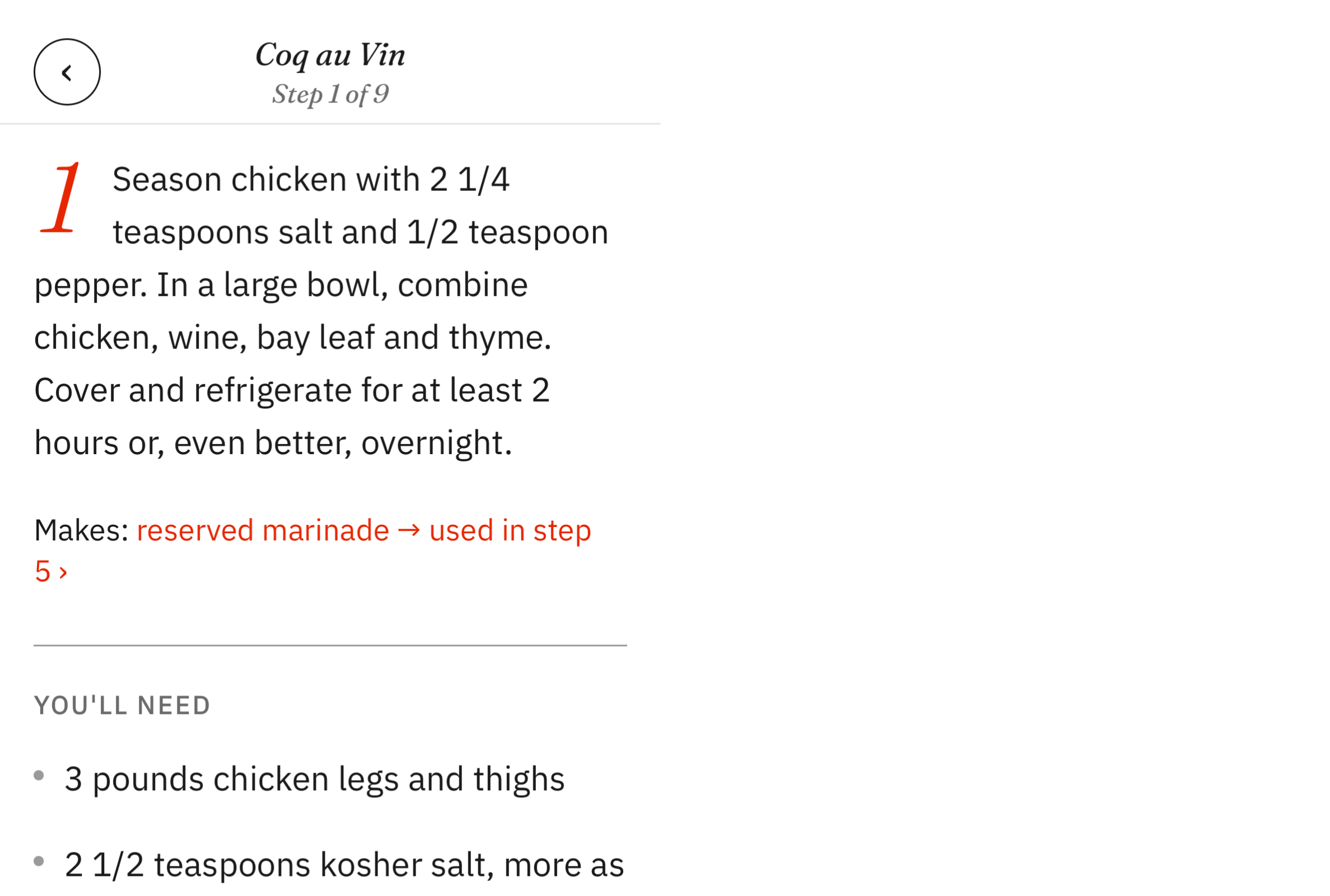
Feeling confident, I imported the Coq au Vin I'd made the week before. Disaster. Easy connections came through, but ingredients split across steps got lost, and the marinade — mixed early, set aside, added back later — vanished entirely. The logic had no concept of a thing the recipe makes.

That gap became the heart of the app: track the things a recipe makes, and "add the reserved marinade" turns into something you can tap. Baking punched new holes, and half a dozen test recipes later, the logic held.

A recipe isn't two lists. It's things that combine, split, wait, and come back.

Mid-build, NYT Cooking shipped Cook Mode. I panicked.

Near the end of the project I discovered NYT Cooking had added a Cook Mode that lists ingredients under each step. Crouton and Pestle, the two most design-respected indie recipe apps, already show amounts inside steps too. A gut punch. Had I spent all this time building something that already existed?

So I swept the landscape properly instead of taking my early glance on faith. The forward direction is covered, and I have to concede it. But the reverse — tap an ingredient, see every step it touches — I couldn't find anywhere. Neither was split-ingredient tracking, or components that get made and set aside. In one recipe-app community survey, users were describing my exact problem, down to the carrots split across two steps. Requested, never built.

The sharpest find came from professional kitchen software, which models a recipe as connected components — things made, held, and folded back in. Consumer apps model it as two flat lists and, at best, draw lines between them in one direction. That gap is the whole reason this app has a case study.

Users were asking for exactly this. Nobody had built it.

The real usability lab was dinner.

I mocked every screen in Figma — spacing, type scale, touch targets — and carried the system back into the build. One rule did most of the work: red means a connection you can follow, and nothing else. Everything that isn't a connection stays quiet so the one idea reads instantly.

Then I cooked. Round after round of actual dinners surfaced what you only catch with wet hands: tap targets you can hit while stirring, error messages that say something useful, where your eye lands mid-step. The navigation, the import language, the empty states all got tuned at the stove. It's in solid beta now.

On the branding.

I went minimal and utilitarian with one flourish. Fraunces Light Italic carries the editorial voice, IBM Plex Sans keeps it business-first — its full-height fractions alone earned it the job in an app full of measurements. One color, a Braun-inspired red, and it only ever means one thing: a connection you can follow. The restraint around the color is what makes it land.

The name is a play on mise en place — everything in its place, nothing skipped, nothing doubled. In the wordmark, the red "en" ties into "place" with a hand-drawn ligature: two things joined across a boundary, which is the whole app in one stroke.

Nothing skipped. Nothing doubled.

What I'd do differently.

The testing pool was me, my wife, and a lot of dinners. That's real use, but it's not research, and a feature this unfamiliar needs strangers. The import logic held up across the recipes I threw at it, but the long tail of recipe sites is unproven, and shipping it for real would mean moving the AI work behind a proper backend. The demo above runs the full experience on one recipe — bake the pie. If you want the real app with import, email me.